My Augmented Addiction

I’ve revived my six-year-old blog having been buried in the trenches of living a corporate digital innovation career. I’ve spent my silence more than doubling my sentence in the digital experience realm (it’s not a jail, I’m still as obsessed as I was when I discovered ICQ in ’99) and in a sporadic visit to this content I realized how fascinating it is to see how, well, things haven’t really changed…

In 2010 I posted about Topshop’s virtual try on tool. Who would’ve imagined the first brand to embark in virtual try-on for beauty would be a UK high-street fashion brand? One key lesson I’ve learned in my career is “don’t be the first, be the best.” and sometimes being first-to-market is a short-term gain. Since Topshop, who I will guess dropped their tool due to low adoption rate, poorly measurable ROI which may have resulted in un-justifiable license fees from Taaz, a string of beauty brands have adopted facial recognition technology and received masses of publicity over it (I’m looking at you, L’Oreal). What is most fascinating to me is that the consumer adoption has only begun to take off now, in 2016… six YEARS since Topshop. Note: when I say take off I mean beyond the Gen Z and Millennials. Thank you, Snapchat and MSQRD. You know it’s something for keeps when Mark Zucks gets in the action. What’s the bet Facebook will integrate MSQRD tech into the Facebook platform soon? I digress…

Back to the beauty boat. I wanted to blog this because I have spent the past 24 months of my career in concept, pitching, scraping budget, planning and finally launching a facial recognition app for my current brand (you can download it here). It’s my augmented addiction and a slight passion project because I believe it’s the future of immersive digital experience. While my app isn’t the traditional “Try on” approach, I wanted to take the technology a different route because my feeling is that while try on is fun and snapchat geo-lens can make you look like you’re a perfect 10, it’s purely instant gratification vs value. More of a marketing approach than a service tool. I feel facial recognition can be used for so much more. I really wanted to expand its value as a teaching tool. My original pitch was to a makeup brand, but it didn’t work out, so skincare is where it lives for now. As a concept, facial recognition technology as a teaching tool has so much potential and I know this will be a valuable tech investment if a company really got behind it.

Sephora’s pocket contour class is the closest yet – I hope they don’t stop there. This is the closest to bricks-to-clicks experience we have and I’m so excited to see it evolve and honored to be a part of it.

Topshop Digitalistas of Fashion

TopShop are innovators in the digital revolution of the fashion industry. They’ve installed digital technologies in-store to enhance their customer experience and created many digital programs to engage their audience, I’m always excited to see what’s next for the brand.

Some digital/social campaigns I’ve noted and enjoyed are:-

In-Store Virtual “fitting room”

Topshop set up a virtual fitting room in the form of a giant iPad its flagship store in Moscow. Using Microsoft Kinect mixed with augmented reality the virtual fitting room let shoppers try on clothes without needing to get undressed – what bliss for a girl!

The giant iPad had a built-in camera that recognised the human body and superimposes a 3D model of a garment which shoppers can switch to different ensembles using simple gestures, all powered by Kinect.

Watch the video to see how genius this concept is…

  • Link-up with SCVNGR which they did in September 2011 for back-to-school. Students had to undergo challenges in-store with their mobile device to earn rewards such as shopping sprees and discounts.
  • Pinterest x Topshop Digital Gift Guide always innovating the clicks-t0-bricks this was a great pilot for tapping into pinners during the holiday season. The digital screen synced to Pinterest in their NYC and London flagships to allow shoppers to build their wish list from stores. I personally wouldn’t want people watching my pinning habits but a great test!
  • OOH Data-driven BillboardsTo activate shoppers during fashion week Topshop invested in digital billboards across the UK connected to twitter to display real-time trends. A fantastic way to be real-time relevant and capitalize on all the FOMO of fashion week by giving people something to be part of.

…and of course, their virtual makeover tool which they used to launch their venture into cosmetics. My love for this is known by my previous blog post..

So what’s next for Sir Philip Green’s giant brand? My suggestion would be RFID technology in their fitting rooms. They’ve already install RFID tags in their clothes, so why not use this to go one-step further and link it to their fitting rooms.

A company that has innovated this technology is DDB Singapore with a Musical Fitting Room. The idea from DDB Singapore was to create state-of-the-art fitting rooms at fashion stores because they say  “The youth define themselves by the type of music they listen to and by the clothes they wear.” Taking that insight, DDB combined music and fashion – two things I’ve always felt go hand-in-hand and both are very powerful forms of self-expression for the youth – so snap it up Phil! Before Urban Outfitters do…!

MissSelfridge.com Magic Mirror: Try It On!

I was thrilled to learn today of a well-known UK high street fashion brand taking the plunge to overcome that online shopping boundary. Missselfridge.com have launched a fantastic application that uses Motion Capture technology via a webcam to help you virtually “try it on” clothing via a Magic Mirror

Try it for yourself here http://www.missselfridge.com/webapp/wcs/stores/servlet/StaticPageDisplay?catalogId=33055&storeId=12554&brdcrmb_trail=&identifier=ms2-christmas-try-it-on&intcmpid=MSHOME_MAGICMIRROR

Missselfridge.com aren’t the first to try this, but they’re probably the most high profile brand to be using it at the moment. It seems Tobi.com first introduced this concept back in November 2009, however it relied on the user printing a paper which seems like a bit more effort on the users part. Tobi.com don’t use their tool either, so perhaps its a sign its not so effective? We’ll see how long Miss S run it.

Below is the video instructions Tobi.com used to explain how their tool worked.

I think this is the way forward anyway and I’m excited to see online teams trying something new, it’s been a while!

If anyone knows who made MissSelfridge.com’s Magic Mirror please tell us! The only service I can find that create this is Zugara who created Tobi.com’s application. Zugara seem’s like a great, innovative company with some exciting projects under their belt where they’ve used motion capture with augmented reality.

Fits.me Virtual Fitting Room for Men!

Fits.me have developed a robot mannequin that adjusts itself to the size of your body. This tool, developed by Fits.me, enables the visitor to input their measurements, including height, waistline and arm length, into a programme which then adjusts the mannequin to appear as the shap of your body. You can then select your clothing size to see which fits best.

See Fits.me online video explanation of this below.

While I think its great to see this, I’m not sure how many men will actually use it. Men are renowned for “no nonsense shopping” so will they want to go to the effort of measuring themselves, creating their mannequin and then sampling the different sizes? which really isn’t 100% accurate because it depends on the retailer photographing and styling the garment correctly.

A retailer that has taken the leap in utilising this is Hawkes & Curtis. Try Hawkes & Curtis Fits Me Application here – try it out and see what you think, I’m not sure, but as always I do love to see new things tried and tested!

MarcJacobs.com: The “Virtual Shop”

The concept of translating a bricks and mortar store environment into a virtual world is something I’ve always wanted to see a fashion brand try, I’m burning to find out if changing the format of the endless boring ecommerce websites today would work!? I would hazard a guess that considering today’s web-savvy shopper, the new tools we have available and if thoroughly thought through and very well designed, it just might! However, what I have witnessed today has made me question myself.

The brand that has taken on the challenge is Marc Jacobs. Initially I was told about this website by a team of creatives I work with. They were laughing about whether it was a joke? Or had the site been hacked? When I asked why, they said because it looks like a cartoon of an actual shop with actual store characters and speech bubbles. Immediately my burning question came to mind, secretly wishing, hoping and praying they were wrong and the amazing brand that is Marc Jacobs had taken on the challenge and succeeded…

I was wrong.

When I first landed on marcjacobs.com my initial feeling was that the homepage was pleasant. The ‘cartoon’ building is grand, pretty and it’s clearly a store. When I looked again I saw the “window displays” had videos in them and I immediately thought “tacky”. My opinion grew as I noticed the cheesy cartoon character with the speech bubble saying “Welcome to Marc Jacobs, please come inside”. Dare I go further?

Dare, I do…

The next page is an interior of a store, with more cheesy cartoon characters and their associated speech bubbles. It continues in this format throughout the website. Thankfully the product detail page isn’t an image of a checkout, but I wouldn’t have been surprised!

There is a “site credits” link on the footer. Create The Group is the agency that have done this (why they’d want to be credited to it, I don’t know) and looking at their portfolio its highly surprising. CTG were responsible for some world-class websites, so I can only hope and presume that this error of a website was the result of an overly ambitious client-side creative team who have no understanding or skills in web design.

For a low-end fashion brand, this might have been worthy of a “well done for trying” response and I’d see the humour in its effort, but what has begun to annoy me greatly is why would I want to spend $1,295.00 on a Marc Jacobs Tweed Fur Melange Bag when it looks like they’ve spent less commissioning an 8 year old child to design their website? You don’t walk into a McDonalds and be expected to dine a la carte, so why do Marc Jacobs think this kind of format for a designer online fashion store will work or be an acceptable platform for its customers to shop?

Lets just hope its an Marc Jacobs AW10 experiment and soon Marc Jacobs SS11 will be here and all will be forgotten…

Joules.com: New vs. Old

One of the clothing brands I’ve looked to for inspiration over the past 2 years is Joules Clothing. They are a lovely lifestyle brand for women, men and children and promote healthy and active lives. A brand that is British to its core, which in itself is very refreshing.

To my initial glee and excitement I read that they’ve re-designed their website. I liked their old website anyway so I was keen to see how they’d developed it… so I won’t beat around the bush, I am disappointed with the new look.

NEW Joules.com

OLD Joulesclothing.com

My opinion is that the brand is completely diluted into a bland website that conforms to the standardised layout that all the top clothing brands seem to be doing these days. I understand we’re all learning from each other and it must work if the likes of ASOS, Topshop and Warehouse are doing it, but I think this is an utterly wrong approach. Let’s grow some distinction and not be afraid to try something new.

Joules Head of IT said “We had to take into account not only our presence here in the UK but also the online requirements of our franchisees, sales partners and distributors throughout the rest of the world.” (read the article this quote came from on Drapers http://bit.ly/d50EQp). From this statement I can understand they might want to back away from the patriotism to Britain in order to appeal to a wider world audience, but does it really need to come at a price of losing the brand’s heritage?

My biggest disappointment with their new website is the dilution of their “Living the Good Life” area; this was a superb area of brand content which they’ve now converted to be “just a blog”. If you didn’t see it before, it was a brand experience full of beautiful graphics, videos and clickable areas that were immersive and, if I were in control, would have been developed into so much more with the new website. Visit the Joules blog here http://blog.joules.com/

Don’t get me wrong, I don’t think the new website is bad at all. In fact the homepage is lovely, bold and inspiring and the navigation holds a hint of their branding. The entire website has everything it should and flows well, but in short, it is a total ASOS.com replica so how could it be perceived badly? There isn’t much point in carrying out a website review of joules.com because we’ve seen everything it has to offer on ASOS.com.

H&M UK Online Store Review

Today I received a VIP invite to shop online at H&M’s brand new online store, which is due to launch on 16th September 2010. Here is a peak at the landing page:

At first glance it’s a safe bet. Simplistic, basic and on-brand for H&M that takes their high street stores online consistently as well as following suit with their European ecommerce websites. Plus, no use of flash which is a thumbs up from me.

Interestingly they’ve added a level between the product listing page and the product detail page on some product options. The extra level shows related items and “you might also like” style options. At first this threw me and I wondered whether the preview was going to allow me to shop, but once I clicked an item from this level it took me to the product detail page.

The product detail page is simple. They haven’t made much of the zoom functionality, it doesn’t allow visitors to manoeuvre around the item, it only offers one zoom area which I assume is to get a feel for fabric and print. There aren’t alternative image options either, which is disappointing.

I like the “post to blog” link on product detail pages, this is interesting. How they manage their affiliate marketing will be one to watch and I’m sure the “post to blog” tool will positively aid success with affiliates.

So I’m making my purchases. I’ve been looking for an aviator jacket and H&M have a perfect match for me! Plus, I didn’t know H&M did homeware until now so I’m buying a gorgeous floral printed towel. Using the “post to blog” tool, this is what I’m buying…


Visit hm.com


Visit hm.com

Oo a sneaky call-to-action in the “post to blog” code, I like it!

I’m at the checkout and at this point the additional product suggestions displayed in “Something for you” suit me enough to encourage me to click on them (I’m on the hunt for camel coloured outerwear). I like how the suggested items on the checkout page don’t navigate you away from this area, this will help keep the customer focused on the goal of check out.

I decided against adding any of the items shown, so I click “Go to checkout”. I’m surprised at this point to see another “suggested items” pop-up, especially as the items suggested are bland, this feature is unnecessary, so I ignore it.

I’m registering to purchase, surprised that they ask if I’m over 18 and if I have children. I don’t have children, but I’ve ticked the box because I’m intrigued. Another dropdown appears after this asking the year “my children” were born for up to 4 children. I put the age of my niece… perhaps they’ll send marketing e-mails each year relevant to her age? I hope so.

I’m now at the stage of “check your order” and its telling me delivery timescales. Disappointingly, my aviator jacket won’t be dispatched until early October, what if I was moving house by this date? I’ve gone ahead anyway, because I really want that jacket!

I’m surprised again when I get to payment method. They’re allowing me to pay monthly after delivery with 45 days credit, so I don’t have to give them any payment details at all!? I’ve made the transaction on this option because I don’t want to pay for something I won’t receive until October, so watch this space! I’ll update this post when I receive my new purchases…

Overall I think I’m satisfied with H&M’s online offering. Its a brand that doesn’t need to try hard because they consistently deliver. To me, H&M isn’t distinctive, its value for money and sits centre in the fashion triangle with topshop, gap and primark delivering somthing for everyone in these markets. Fashionable and on-trend like topshop, basic essentials like gap all delivered with similar price points, if not slighly higher, to primark.

Interactive Flash Merchandising

Anyone who manages an e-commerce website will (or should!) always be looking for ways to improve conversion rates from the homepage. For fashion brands this will be no exception. Each season fashion marketers work with creative teams or agencies to produce glorious campaign imagery or videos to support the new collection or season theme. Often a majority of the images or videos created for collection campaigns aren’t ever or rarely seen by the customer and so become unappreciated.

Ecommerce managers strive to find ways to quicken the visitor process from the website homepage to product to purchase and checkout. There are a growing number of solutions to help this, such as ‘quick buy’ and deep linking, but a new method that is surely to become more and more popular is called flash merchandising.

So what is it? Flash merchandising is a unique tool that combines flash media and ‘quick buy’ functionality. Think about any flash websites you have seen or flash videos you have watched, have you ever been able to purchase directly from them? likely not! until now…

Now we can create rich collection campaigns in the form of videos and imagery and allow viewers to purchase directly through the material they’re viewing, so there is less need to visit the product detail page. A website that uses this technology is Tesco Clothing who use flash merchandising on their homepage and allow visitors to  click directly onto a product embedded into a flash panel and purchase from it without navigating from the homepage. See below.

In the above example you can see how Tesco Clothing use flash merchandising to promote World Cup sales and allow visitors to buy featured products from the homepage. Needless to say, this technology is doing wonders for increasing homepage conversion rates.

Its something I think will work wonders for enhancing fashion campaigns online. Its an opportunity to engage customers even more into online media and really maximise ROI. With this technology marketers should ask themselves; why continue to spend enormous budgets on producing campaigns without a method to measure its success? Online marketeers constantly analyse every inch of their website, so now lets allow offline marketers the same opportunity.

Mix Match Me Please!

I love it when an online fashion store challenges the boundaries of shopping online, its a very rare occurence that it is challenged in a new way. It really surprises me how little the big, well-known fashion brands try. You’d think the likes of ASOS.com would create innovative experiences a lot, being that they’re the most popular fashion outlet… perhaps they think that their market doesn’t need fancy tools or fun ways to shop online? judging by their product listing pages I’d say I’m right! But, as a shopper in their target market I’ll stamp my feet and demand more! I want something new!

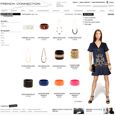
A while ago I stumbled across a really fun and practical tool that aims to break the virtual shopping barrier. The tool is by MixMatchMe and this is in use for boden.co.uk http://boden.mixmatchme.com/MME/boden/home.aspx and also French Connection http://fcuk.mixmatchme.com/MME/fcuk/home.aspx. In short, its great!

The tool allows you to dress a virtual model from head to toe! It also allows layering, which looks really effective. As far as I can tell they use the same model on all versions, which is something to improve on (customisation please, I’m blonde!).

I think this tool will really help raise AOV (average order value) because its the virtual method of visual merchandising, offline have mannequins, online have MixMatchMe. Granted this tool probably wouldnt work for all brands, I doubt men would bother, but us girls love playing dress up so I urge more fashion brands to jump on the bandwagon!

Riverisland.com Review

Recently I’ve become to feel a bit frustrated with this particular fashion retailers website http://www.riverisland.com

I won’t go straight into the negatives because I have to say I am a great appreciator and avid fan (as much as an online marketer could be) of River Island’s e-mail marketing. Their e-mail creative is exactly what I look for in an e-mail, inspiring styling, aspirational themes and exciting bold colours with large imagery that show the products perfectly – just what a girl needs to drive her to start shopping! (to see an example of their e-mails, click here)

So imagine my bitter disappointment when I decide to take the plunge and click one of these gorgeous e-mails, which is not a decision I take lightly, you have to earn my click! But by deciding to click, I set my expectation of seeing more beautiful imagery, colour and styling, only to be faced with a bland, white website that fits the smallest of screen resolutions and presents small images that do not evoke any sort of excitement and do little for encouraging me to explore, let alone purchase (I would love to know what their transaction rates are from their e-mail marketing!)… And worst of all, its FLASH and I am downright shocked they don’t offer a HTML alternative.

Here’s what you get if you don’t have flash (or a lower version than flash player 8)

And here is what you get if you do…

I don’t think the homepage is too bad, although the header navigation requires a click to view the dropdown which is a bit of a no no for me. The frustrating element of this website is the product listing page and product detail pages, both are ridiculously small.

Product listing page

Horizontal scroll? No thanks. Animated banners constantly distracting me from browsing? I’ve had enough already…

Product detail page


…So I quickly click an item, if at least to be away from the annoyance of the listing page. I’m quickly annoyed further by the fact that the product detail page opens as a pop-up, much how you’d expect a “quick buy” tool to work. The listing page animated banners are still moving, which is making me anxious. The product zoom is OK, it shows a clear view of a close up, but there aren’t any additional views – what’s the back like? Hello?

So I should end my rant on a positive in that I’m loving how River Islands clothing is developing into some gorgeous on-trend styles and shapes. Although my online experience has been disappointing I am still going to head into one of their many retail outlets this weekend for a real swim in the River Island. Hats off to the product people, but wake up web team…!